


Show HN: Windows 7 GUI for the Web
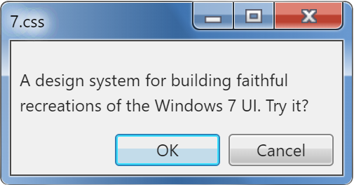
7.css
A design system for building faithful recreations of old UIs.


Intro
7.css is a CSS framework for building interface components that look like Windows 7. It is built on top of the GUI backbone of XP.css, which is an extension of 98.css.
Hello, world!
This framework relies on the usage of semantic HTML. To make a button, you'll need
to use a . Input elements require labels. Tabs rely on the role="tab"
attribute.
This page will guide you through that process, but accessibility is a primary goal of this project.
You can override many of the styles of your elements while maintaining the appearance provided by this framework. Need more padding on your buttons? Go for it. Need to add some color to your input labels? Be our guest.
This framework does not contain any JavaScript, it merely styles your HTML with some CSS. This means 7.css is compatible with your frontend framework of choice.
Installation / Usage
The fastest way to use 7.css is to import it from unpkg.
You can also install 7.css from npm.
Installation
npm install 7.css
Usage
import "7.css/dist/7.css";
Scoping
In case you need 7.css to coexist with another CSS/styling framework, you may use the 7.scoped.css
stylesheet instead to scope the styling within a win7 class.
unpkg:
https://unpkg.com/7.css/dist/7.scoped.css
or npm:
import "7.css/dist/7.scoped.css"
Then in your code, wrap the component with .win7:
Show code
<div class="win7">
  <button>A Win7-styled buttonbutton>
div>
Also note that using the scoped stylesheet will eliminate the scrollbar styling as well.
Tree-shaking
In case you only need the styling of certain components rather than the complete stylesheet as a whole, you may import them separately as below:
unpkg:
https://unpkg.com/7.css/dist/gui/buttons.css
https://unpkg.com/7.css/dist/gui/tabs.css
or npm:
import "7.css/dist/gui/buttons.css"
import "7.css/dist/gui/tabs.css"
For more components, see the published gui folder.
Components
Balloon
A balloon is a small pop-up window that informs users of a non-critical problem or special condition in a control.
A balloon or tooltip can be created using the role="tooltip" attribute.
Show code
<div role="tooltip">A balloon is better known as tooltip in web development.div>
A control may bind to a balloon with the aria-describedby attribute.
You will need to set up an event for the control to trigger the balloon.
Show code
<input type="text" placeholder="Press Enter" aria-describedby="balloon-password" />
<div role="tooltip" id="balloon-password" hidden>Press Backspace to dismissdiv>
To change the position of the balloon, which subsequently change the placement of its tail, combine the respective vertical and horizontal classes:
- Vertical:
.is-top/.is-bottom - Horizontal:
.is-left/.is-right
Show code
<div role="tooltip">This balloon is positioned bottom right of the source control (default behavior).div>
<div role="tooltip" class="is-bottom is-left">This balloon is positioned bottom left of the source control.div>
<div role="tooltip" class="is-top is-left">This balloon is positioned top left of the source control.div>
<div role="tooltip" class="is-top is-right">This balloon is positioned top right of the source control.div>
Button
A command button, also referred to as a push button, is a control that causes the application to perform some action when the user clicks it.
A standard button measures 75px wide and 23px tall with 12px of horizontal padding by default.
They are styled with 2 shades of gray as a vertical gradient.
Show code
<button>Click mebutton>
When buttons are clicked, the gray gradient is shifted to corresponding sky blues.
The following button is simulated to be in the pressed (active) state.
Show code
<button>I am being pressedbutton>
Disabled buttons have solid background and lighter border.
Show code
<button disabled>I cannot be clickedbutton>
Button focus is communicated with a dotted border, set 4px within the contents of the button.
The following example is simulated to be focused.
Show code
<button>I am focusedbutton>
A default button (in Windows, hitting the Enter key in a dialog context triggers the button)
has a greenish-blue border and a light blue gradient shade.
Show code
<button class="default">I am the one!button>
The button styles are also applied to the file input element. Due to the complex setup, the
styles of the standard button's states (hover, active, focus etc.) cannot be applied to the file input button.
Show code
<input type="file" />
You can use the below workaround to apply the complete button styles to a file input element. In this
setup, the file input is hidden and a label with the role="button" attribute is used
to trigger the file selection dialog. The tabindex="0" attribute ensures the button is keyboard accessible.
Some JavaScript is required if you want the label to trigger when it is focused and activated with the keyboard.
Show code
<label role="button" tabindex="0"><input type="file" /> Choose filelabel>
<label role="button" tabindex="0" class="default"><input type="file" /> Browse...label>
CheckBox
A check box represents an independent or non-exclusive choice.
Checkboxes are represented with a sunken panel, populated with a "check" icon when selected, next to a label indicating the choice.
Note: You must include a corresponding label after
your checkbox, using the element with a for attribute
pointed at the id of your input. This ensures the checkbox is easy to use with
assistive technologies, on top of ensuring a good user experience for all (navigating with the tab key,
being able to click the entire label to select the box).
Show code
<input type="checkbox" id="example1">
<label for="example1">This is a checkboxlabel>
Checkboxes can be selected and disabled with the standard checked and disabled
attributes.
Show code
<div class="group">
  <div>
    <input checked type="checkbox" id="example2">
    <label for="example2">I am checkedlabel>
  div>
  <div>
    <input disabled type="checkbox" id="example3">
    <label for="example3">I am inactivelabel>
  div>
  <div>
    <input checked disabled type="checkbox" id="example4">
    <label for="example4">I am inactive but still checkedlabel>
  div>
div>
Collapse
Users can show or hide additional information including data, options, or commands.
A collapsible section can be created using the elements 🎉 Tadah!
details and
summary.
Expand me to see something interesting
Show code
<details>
  <summary>Expand me to see something interestingsummary>
  <p>🎉 Tadah!p>
details>
Add an open attribute to expand the content by default.
I open myself willingly
Show code
<details open>
  <summary>I open myself willinglysummary>
  <ul>
    <li>This is my familyli>
    <li>This is my houseli>
    <li>This is my carli>
  ul>
details>
Combobox
A combo box is a combination of a standard list box or a drop-down list and an editable text box, thus allowing users to enter a value that isn't in the list.
To render a combo box, use a text input, a button,
a parent ul, and children li together,
wrapped inside a container element with the combobox class.
For accessibility, follow the minimum requirements as below:
- Add a
role="combobox"attribute to the textinput - Add a
role="listbox"attribute to theul - Add a
role="option"attribute to eachli -
Specify the relationship between the list box and the text box by combining
the
idof thelistboxwith thearia-ownsattribute on the textinput
- Amazon
- Apple
- Netflix
Show code
<div class="combobox">
  <input type="text" role="combobox" aria-owns="company" />
  <button>button>
  <ul role="listbox" id="company">
    <li role="option">Facebookli>
    <li role="option">Amazonli>
    <li role="option">Appleli>
    <li role="option">Netflixli>
    <li role="option">Googleli>
  ul>
div>
For more options of the list box, see the ListBox section.
Dropdown
A drop-down list box allows the selection of only a single item from a list. In its closed state, the control displays the current value for the control. The user opens the list to change the value.
Dropdowns can be rendered by using the select and option
elements.
Show code
<select>
  <option>5 - Incredible!option>
  <option>4 - Great!option>
  <option>3 - Pretty goodoption>
  <option>2 - Not so greatoption>
  <option>1 - Unfortunateoption>
select>
By default, the first option will be selected. You can change this by
giving one of your option elements the selected
attribute.
Show code
<select>
  <option>5 - Incredible!option>
  <option>4 - Great!option>
  <option selected>3 - Pretty goodoption>
  <option>2 - Not so greatoption>
  <option>1 - Unfortunateoption>
select>
Disabled dropdown.
Show code
<select disabled>
  <option>0 - Dropdown disabledoption>
select>
GroupBox
A group box is a special control you can use to organize a set of controls. A group box is a rectangular frame with an optional label that surrounds a set of controls.
A group box can be used by wrapping your elements with the fieldset tag.
It contains a sunken outer border and a raised inner border, resembling an engraved box
around your controls.
Show code
<fieldset>
  <div>Select one:div>
  <div>
    <input id="radio5" type="radio" name="fieldset-example">
    <label for="radio5">Dinerslabel>
  div>
  <div>
    <input id="radio6" type="radio" name="fieldset-example">
    <label for="radio6">Drive-Inslabel>
  div>
  <div>
    <input id="radio7" type="radio" name="fieldset-example">
    <label for="radio7">Diveslabel>
  div>
fieldset>
You can provide your group with a label by placing a legend element
within the fieldset.
Show code
<fieldset>
  <legend>Today's moodlegend>
  <div>
    <input id="radio8" type="radio" name="fieldset-example2">
    <label for="radio8">Claire Saffitzlabel>
  div>
  <div>
    <input id="radio9" type="radio" name="fieldset-example2">
    <label for="radio9">Brad Leonelabel>
  div>
  <div>
    <input id="radio10" type="radio" name="fieldset-example2">
    <label for="radio10">Chris Moroccolabel>
  div>
  <div>
    <input id="radio11" type="radio" name="fieldset-example2">
    <label for="radio11">Carla Lalli Musiclabel>
  div>
fieldset>
There is a handy group utility class provided out of the box which can be used
to group elements without the need for a fieldset, and ensure a consistent
spacing between them.
Show code
<div class="group">
  <div>
    <input checked type="checkbox" id="example12">
    <label for="example12">I am checkedlabel>
  div>
  <div>
    <input disabled type="checkbox" id="example13">
    <label for="example13">I am inactivelabel>
  div>
  <div>
    <input checked disabled type="checkbox" id="example14">
    <label for="example14">I am inactive but still checkedlabel>
  div>
div>
ListBox
With a list box, users can select from a set of values presented in a list that is always visible.
There are 2 ways you can render a list box. The simple one is using the select
element with a multiple attribute specified.
Show code
<select multiple>
  <option>5 - Incredible!option>
  <option selected>4 - Great!option>
  <option>3 - Pretty goodoption>
  <option>2 - Not so greatoption>
  <option>1 - Unfortunateoption>
select>
The complex one is using a combination of the ul/li elements
with the role attributes.
- Amazon
- Apple
- Netflix
Show code
<ul role="listbox">
  <li role="option">Facebookli>
  <li role="option" aria-selected="true">Amazonli>
  <li role="option">Appleli>
  <li role="option">Netflixli>
  <li role="option">Googleli>
ul>
The latter offers more flexibility over using a mere select element.
Choose the one that is more appropriate depending on your context or use case.
To add a drop shadow to the list box, use the has-shadow class.
To add a hovering style on the list box items (using role attribute only),
use the has-hover class.
- Amazon
- Apple
- Netflix
Show code
<ul role="listbox" class="has-shadow has-hover">
  <li role="option">Facebookli>
  <li role="option">Amazonli>
  <li role="option">Appleli>
  <li role="option">Netflixli>
  <li role="option">Googleli>
ul>
ListView (table)
With a list view, users can view and interact with a collection of data objects, using either single selection or multiple selection.
Currently, the ListView is only implemented as the Details view, which styles tables.
| Name | Date Taken | Tags | Size | Rating |
|---|---|---|---|---|
| Toco Toucan | 6/24/2005 12:22 PM | Sample; Wildlife | 113 KB | * * * * * |
| Dock | 6/22/2005 8:17 PM | Sample; Ocean | 310 KB | * * * * * |
| Autumn Leaves | 11/4/2005 6:12 PM | Sample; Landscape | 270 KB | * * * * * |
Show code
<table>
  <thead>
    <tr>
      <th>Nameth>
      <th>Date Takenth>
      <th class="highlighted indicator">Tagsth>
      <th>Sizeth>
      <th>Ratingth>
    tr>
  thead>
  <tbody>
    <tr>
      <td>Toco Toucantd>
      <td>6/24/2005 12:22 PMtd>
      <td>Sample; Wildlifetd>
      <td>113 KBtd>
      <td>* * * * *td>
    tr>
    <tr class="highlighted">
      <td>Docktd>
      <td>6/22/2005 8:17 PMtd>
      <td>Sample; Oceantd>
      <td>310 KBtd>
      <td>* * * * *td>
    tr>
    <tr>
      <td>Autumn Leavestd>
      <td>11/4/2005 6:12 PMtd>
      <td>Sample; Landscapetd>
      <td>270 KBtd>
      <td>* * * * *td>
    tr>
  tbody>
table>
Here's another example showcasing advanced usage, for example:
-
The handling of long text (using the
widthproperty of the table to limit the width) -
Using the
has-shadowclass to add a shadow to the table -
Flipping the column header sort indicator by adding the
upclass -
Changing text alignment using the
text-alignproperty -
The
highlightedcolumn header style without sort indicator (I didn't want to add another table just for that)
| Name | Original Location | Date deleted | Size | Type |
|---|---|---|---|---|
| contents_files | D:\Users\user\Documents\contents_files | 3/29/2007 12:00 AM | 4 KB | File Folder |
| Windows Vista User Experience Guidelines | D:\Users\user\Documents\Windows Vista User Experience Guidelines | 3/29/2007 12:00 AM | 0 KB | File Folder |
| AutoRecovery save of Document.asd | D:\Users\user\Documents\AutoRecovery save of Document.asd | 3/23/2007 12:00 AM | 27 KB | ASD File |
| AutoRecovery save of Tree Views.asd | D:\Users\user\Documents\AutoRecovery save of Tree Views.asd | 3/13/2007 12:00 AM | 693 KB | ASD File |
| contents | D:\Users\user\Documents\contents | 3/29/2007 12:00 AM | 2 KB | HTML Document |
Show code
<table class="has-shadow" style="width: 460px">
  <thead>
    <tr>
      <th>Nameth>
      <th>Original Locationth>
      <th class="highlighted">Date deletedth>
      <th>Sizeth>
      <th class="highlighted indicator up">Typeth>
    tr>
  thead>
  <tbody>
    <tr>
      <td>contents_filestd>
      <td>D:\Users\user\Documents\contents_filestd>
      <td>3/29/2007 12:00 AMtd>
      <td style="text-align: right">4 KBtd>
      <td>File Foldertd>
    tr>
    <tr>
      <td>Windows Vista User Experience Guidelinestd>
      <td>
        D:\Users\user\Documents\Windows Vista User Experience Guidelines
      td>
      <td>3/29/2007 12:00 AMtd>
      <td style="text-align: right">0 KBtd>
      <td>File Foldertd>
    tr>
    <tr>
      <td>AutoRecovery save of Document.asdtd>
      <td>D:\Users\user\Documents\AutoRecovery save of Document.asdtd>
      <td>3/23/2007 12:00 AMtd>
      <td style="text-align: right">27 KBtd>
      <td>ASD Filetd>
    tr>
    <tr>
      <td>AutoRecovery save of Tree Views.asdtd>
      <td>
        D:\Users\user\Documents\AutoRecovery save of Tree Views.asd
      td>
      <td>3/13/2007 12:00 AMtd>
      <td style="text-align: right">693 KBtd>
      <td>ASD Filetd>
    tr>
    <tr>
      <td>contentstd>
      <td>D:\Users\user\Documents\contentstd>
      <td>3/29/2007 12:00 AMtd>
      <td style="text-align: right">2 KBtd>
      <td>HTML Documenttd>
    tr>
  tbody>
table>
Navigation
The following components compose a complete navigation menu, also known as Navbar.
Menu
Menus are hierarchical lists of commands or options available to users in the current context.
A menu can be rendered using a composition of a parent ul and child items
li, role="menu" and role="menuitem" attributes
must be specified on the ul and li respectively.
If a menu item has a submenu, add an aria-haspopup="true" attribute to it
to render a caret indicator.
To make the menu focusable, specify the tabindex attributes on the items.
Alternatively, you can use an a to achieve the same.
- View
- Sort by
- Refresh
- Paste
- Paste shortcut
- Screen resolution
- Gadgets
- Personalize
Show code
<ul role="menu" style="width: 200px">
  <li role="menuitem" tabindex="0" aria-haspopup="true">Viewli>
  <li role="menuitem" tabindex="0" aria-haspopup="true">
    Sort by
    <ul role="menu">
      <li role="menuitem"><a href="#menu">Namea>li>
      <li role="menuitem"><a href="#menu">Sizea>li>
      <li role="menuitem"><a href="#menu">Item typea>li>
      <li role="menuitem"><a href="#menu">Date modifieda>li>
    ul>
  li>
  <li role="menuitem"><a href="#menu">Refresha>li>
  <li role="menuitem"><a href="#menu">Pastea>li>
  <li role="menuitem"><a href="#menu">Paste shortcuta>li>
  <li role="menuitem"><a href="#menu">Screen resolutiona>li>
  <li role="menuitem"><a href="#menu">Gadgetsa>li>
  <li role="menuitem"><a href="#menu">Personalizea>li>
ul>
By default, the submenu is only shown when the linked item is focused/clicked.
To add the hovering/mouse-over trigger, you can add a can-hover
class to the root container.
Use a has-divider class to make a horizontal line after the menu item.
Disable a menu item by placing an aria-disabled attribute on it.
You may associate a menu item with an icon by using the img element.
(Icons provided by Icons8)
- View
- Sort by
- Refresh
- Paste
- Paste shortcut
-
 Screen resolution
-
 Gadgets
-
 Personalize
Show code
<ul role="menu" class="can-hover" style="width: 200px">
  <li role="menuitem" tabindex="0" aria-haspopup="true">Viewli>
  <li role="menuitem" tabindex="0" aria-haspopup="true">
    Sort by
    <ul role="menu">
      <li role="menuitem"><a href="#menu">Namea>li>
      <li role="menuitem"><a href="#menu">Sizea>li>
      <li role="menuitem"><a href="#menu">Item typea>li>
      <li role="menuitem"><a href="#menu">Date modifieda>li>
    ul>
  li>
  <li role="menuitem" class="has-divider"><a href="#menu">Refresha>li>
  <li role="menuitem" aria-disabled="true"><a href="#menu">Pastea>li>
  <li role="menuitem" aria-disabled="true" class="has-divider">
    <a href="#menu">Paste shortcuta>
  li>
  <li role="menuitem">
    <img src="https://img.icons8.com/color/18/000000/monitor--v1.png"/>
    <a href="#menu">Screen resolutiona>
  li>
  <li role="menuitem">
    <img src="https://img.icons8.com/color/18/000000/virtual-machine2.png"/>
    <a href="#menu">Gadgetsa>
  li>
  <li role="menuitem">
    <img src="https://img.icons8.com/color/18/000000/remote-desktop.png"/>
    <a href="#menu">Personalizea>
  li>
ul>
To render menu items that are options with bullets and checkmarks, use the corresponding
input type (radio or checkbox).
Show code
<ul role="menu" style="width: 200px">
  <li role="menuitem">
    <input type="radio" name="icon-size" id="example15">
    <label for="example15">Large iconslabel>
  li>
  <li role="menuitem">
    <input type="radio" name="icon-size" id="example16" checked>
    <label for="example16">Medium iconslabel>
  li>
  <li role="menuitem" class="has-divider">
    <input type="radio" name="icon-size" id="example17">
    <label for="example17">Small iconslabel>
  li>
  <li role="menuitem">
    <input type="checkbox" id="example18">
    <label for="example18">Auto arrange iconslabel>
  li>
  <li role="menuitem">
    <input type="checkbox" id="example19" checked>
    <label for="example19">Align icons to gridlabel>
  li>
ul>
MenuBar
A menu bar is a list of labeled menu categories typically located near the top of a window.
A menu bar can be created in a similar manner to the menu, however, use a
role="menubar" attribute in place of role="menu".
- File
- Edit
- View
- Help
Show code
<ul role="menubar">
  <li role="menuitem" tabindex="0">Fileli>
  <li role="menuitem" tabindex="0">Editli>
  <li role="menuitem" tabindex="0">Viewli>
  <li role="menuitem" tabindex="0">Helpli>
ul>
Combining it with the Menu component, we will have a complete menu bar with the associated menu dropdowns.
To accommodate an extra piece of info for a menu item (like a shortcut mnemonic)
on the right side, nest it with an span element.
- File
- Edit
-
View
- Zoom
- Status Bar
- Help
Show code
<ul role="menubar" class="can-hover">
  <li role="menuitem" tabindex="0" aria-haspopup="true">
    File
    <ul role="menu">
      <li role="menuitem">
        <a href="#menubar">
          Open <span>Ctrl+Ospan>
        a>
      li>
      <li role="menuitem">
        <a href="#menubar">
          Save <span>Ctrl+Sspan>
        a>
      li>
      <li role="menuitem" class="has-divider">
        <a href="#menubar">
          Save As... <span>Ctrl+Shift+Sspan>
        a>
      li>
      <li role="menuitem"><a href="#menubar">Exita>li>
    ul>
  li>
  <li role="menuitem" tabindex="0" aria-haspopup="true">
    Edit
    <ul role="menu">
      <li role="menuitem"><a href="#menubar">Undoa>li>
      <li role="menuitem"><a href="#menubar">Copya>li>
      <li role="menuitem"><a href="#menubar">Cuta>li>
      <li role="menuitem" class="has-divider"><a href="#menubar">Pastea>li>
      <li role="menuitem"><a href="#menubar">Deletea>li>
      <li role="menuitem"><a href="#menubar">Find...a>li>
      <li role="menuitem"><a href="#menubar">Replace...a>li>
      <li role="menuitem"><a href="#menubar">Go to...a>li>
    ul>
  li>
  <li role="menuitem" tabindex="0" aria-haspopup="true">
    View
    <ul role="menu">
      <li role="menuitem" tabindex="0" aria-haspopup="true">
        Zoom
        <ul role="menu">
          <li role="menuitem"><button>Zoom Inbutton>li>
          <li role="menuitem"><button>Zoom Outbutton>li>
        ul>
      li>
      <li role="menuitem"><a href="#menubar">Status Bara>li>
    ul>
  li>
  <li role="menuitem" tabindex="0" aria-haspopup="true">
    Help
    <ul role="menu">
      <li role="menuitem"><a href="#menubar">View Helpa>li>
      <li role="menuitem"><a href="#menubar">Abouta>li>
    ul>
  li>
ul>
OptionButton
An option button, also referred to as a radio button, represents a single choice within a limited set of mutually exclusive choices. That is, the user can choose only one set of options.
Option buttons can be used via the radio type on an input element.
Option buttons can be grouped by specifying a shared name attribute on each
input.
Show code
<div style="display: flex; flex-direction: column; gap: 6px">
  <div>
    <input id="radio20" type="radio" name="first-example">
    <label for="radio20">Yeslabel>
  div>
  <div>
    <input id="radio21" type="radio" name="first-example">
    <label for="radio21">Nolabel>
  div>
div>
Option buttons can also be checked and disabled with their corresponding
HTML attributes.
Show code
<div style="display: flex; flex-direction: column; gap: 6px">
  <div>
    <input id="radio22" type="radio" name="second-example">
    <label for="radio22">Peanut butter should be smoothlabel>
  div>
  <div>
    <input checked disabled id="radio23" type="radio" name="second-example">
    <label for="radio23">I understand why people like crunchy peanut butterlabel>
  div>
  <div>
    <input disabled id="radio24" type="radio" name="second-example">
    <label for="radio24">Crunchy peanut butter is goodlabel>
  div>
div>
ProgressBar
A common control that displays the progress of a particular operation as a graphical bar.
Progress bars can be created with a div using role="progressbar",
and another nested div is required to make the inner bar.
Specify the width of the inner bar to indicate the progress.
For accessibility, you might want to specify the respective aria-* attributes.
Refer to MDN
for more information.
Show code
<div role="progressbar" aria-valuemin="0" aria-valuemax="100" aria-valuenow="80">
  <div style="width: 80%">div>
div>
To indicate the progress bar in paused state, add a paused class.
Show code
<div role="progressbar" class="paused">
  <div style="width: 50%">div>
div>
To indicate the progress bar in error state, add an error class.
Show code
<div role="progressbar" class="error">
  <div style="width: 30%">div>
div>
To animate the progress bar, add an animate class.
Show code
<div role="progressbar" class="animate">
  <div style="width: 60%">div>
div>
To create an indeterminate progress bar, add a marquee class
and remove the nested div.
Show code
<div role="progressbar" class="marquee">div>
Scrollbar
A control that allows users to scroll the content of a window, either vertically or horizontally.
To override the browser scrollbar's system styling for a particular section, add a has-scrollbar
class to the container element.
Note that this only works with WebKit-based browsers.
Show code
<div class="has-scrollbar" style="width: 300px; height: 150px; overflow: auto">
  Lorem ipsum dolor sit amet, consectetur adipiscing elit. In nibh massa, viverra non velit vitae,
  scelerisque venenatis risus. Sed posuere risus tellus, sit amet vehicula nunc venenatis ut.
  Nunc convallis augue eget odio imperdiet, eu consequat massa fringilla consectetur eleifend.
  Curabitur in egestas justo, vel fermentum ante. Lorem ipsum dolor sit amet, consectetur elit.
  Cras ullamcorper non nibh et placerat. Nullam ornare lectus eget consequat dignissim.
div>
SearchBox
With a Search box, users can quickly locate specific objects or text within a large set of data by filtering or highlighting matches.
There are 2 variants of the search box available.
An instant search, where the results are displayed immediately as the user types, can be rendered
just by specifying a type="search" attribute on an input element:
Show code
<input type="search" placeholder="Search" />
A regular search, where a search is performed when the user clicks the search button, requires
a search input and a button wrapped inside a container a container element with the class searchbox.
Show code
<div class="searchbox">
  <input type="search" placeholder="Search" />
  <button aria-label="search">button>
div>
Slider
A slider, sometimes called a trackbar control, consists of a bar that defines the extent or range of the adjustment and an indicator that shows the current value for the control...
Sliders can rendered by specifying a range type on an
input element.
Show code
<div style="max-width: 300px; display: flex; align-items: center; gap: 0.5rem">
  <label>Volume:label>
  <label>Lowlabel>
  <input type="range" min="1" max="11" value="5" />
  <label>Highlabel>
div>
You can make use of the has-box-indicator class replace the
default indicator with a box indicator, furthermore the slider can be wrapped
with a div using is-vertical to display the input vertically.
Note: To change the length of a vertical slider, the input width
and div height.
Show code
<div style="display: flex; align-items: center; gap: 0.5rem">
  <label>Cowbelllabel>
  <div class="is-vertical">
    <input class="has-box-indicator" type="range" min="1" max="3" step="1" value="2" />
  div>
div>
Spinner
A spinner or loader, also referred as ProgressRing, is a type of progress control to indicate that an operation is underway and its completion time is unknown.
To render a spinner element, use either a spinner or a loader
class. To animate the spinner, add an animate class.
For accessibility, we use an aria-label attribute with a desired text
to inform assistive technologies about the presence of the spinner.
Show code
<span class="spinner" aria-label="Spinning">span>
<span class="loader" aria-label="Loading">span>
<span class="loader animate" aria-label="Processing your request">span>
Tabs
Tabs provide a way to present related information on separate labeled pages.
Creating tabs
To create a tab, use a menu element with role="tablist".
Then for the tab titles, use a button with role="tab", and set the aria-controls attribute to
the corresponding id of the element with role="tabpanel".
Read more at MDN Web docs - ARIA: tab role
More...
This tab contains a GroupBox
Disabling tabs
Simply add a disabled attribute on the tab.
Justified tabs
Add the justified class to the tablist menu to make the tabs, well, justified.
Disabled Tab
This tab is disabled, so you should not be able to read this.
Show code
<section class="tabs" style="max-width: 500px">
  <menu role="tablist" aria-label="Sample Tabs">
    <button role="tab" aria-controls="tab-A" aria-selected="true">Instructionbutton>
    <button role="tab" aria-controls="tab-B">Examplebutton>
    <button role="tab" aria-controls="tab-C">More instructionbutton>
    <button role="tab" aria-controls="tab-D" disabled>Disabled Tabbutton>
  menu>

  <article role="tabpanel" id="tab-A">
    <h3>Creating tabsh3>
    <p>
      To create a tab, use a <code>menucode> element with <code>role="tablist"code>.
      Then for the tab titles, use a <code>buttoncode> with <code>role="tab"code>, and set the <code>aria-controlscode> attribute to
      the corresponding id of the element with <code>role="tabpanel"code>.
    p>
    <p>
      Read more at <a href="https://developer.mozilla.org/en-US/docs/Web/Accessibility/ARIA/Roles/Tab_Role"
        target="_blank">MDN Web docs - ARIA: tab rolea>
    p>
  article>
  <article role="tabpanel" id="tab-B" hidden>
    <h3>More...h3>
    <p>This tab contains a GroupBoxp>
    <fieldset>
      <legend>Today's moodlegend>
      <div>
        <input id="radio25" type="radio" name="fieldset-example2">
        <label for="radio25">Claire Saffitzlabel>
      div>
      <div>
        <input id="radio26" type="radio" name="fieldset-example2">
        <label for="radio26">Brad Leonelabel>
      div>
      <div>
        <input id="radio27" type="radio" name="fieldset-example2">
        <label for="radio27">Chris Moroccolabel>
      div>
      <div>
        <input id="radio28" type="radio" name="fieldset-example2">
        <label for="radio28">Carla Lalli Musiclabel>
      div>
    fieldset>
  article>
  <article role="tabpanel" id="tab-C" hidden>
    <h3>Disabling tabsh3>
    <p>Simply add a <code>disabledcode> attribute on the tab.p>
    <h3>Justified tabsh3>
    <p>Add the <code>justifiedcode> class to the <code>tablistcode> menu to make the tabs, well, justified.p>
  article>
  <article role="tabpanel" id="tab-D" hidden>
    <h3>Disabled Tabh3>
    <p>This tab is disabled, so you should not be able to read this.p>
  article>
section>
A simplified template is as below:
Show code
<section class="tabs">
  <menu role="tablist" aria-label="Tabs Template">
    <button role="tab" aria-controls="tab-A" aria-selected="true">Tab Abutton>
    <button role="tab" aria-controls="tab-B">Tab Bbutton>
    <button role="tab" aria-controls="tab-C">Tab Cbutton>
    <button role="tab" aria-controls="tab-D" disabled>Tab Dbutton>
  menu>
  <article role="tabpanel" id="tab-A">Tab A is activearticle>
  <article role="tabpanel" id="tab-B" hidden>Tab B is activearticle>
  <article role="tabpanel" id="tab-C" hidden>Tab C is activearticle>
  <article role="tabpanel" id="tab-D" hidden>Tab D is inactivearticle>
section>
TextBox
A text box (also referred to as an edit control) is a rectangular control where the user enters or edits text. It can be defined to support a single line or multiple lines of text.
Text boxes can be rendered by specifying a text type on an
input element. As with checkboxes and radio buttons, you
should provide a corresponding label with a properly set for
attribute.
Show code
<label for="text29">Occupationlabel>
<input id="text29" type="text" />
Additionally, you can make use of the group class
to position your label above the input instead of beside it.
Show code
<div class="group" style="width: 200px">
  <label for="text30">Address (Line 1)label>
  <input id="text30" type="text" />
div>
<div class="group" style="width: 200px">
  <label for="text31">Address (Line 2)label>
  <input id="text31" type="text" />
div>
To support multiple lines in the user's input, use the textarea
element instead.
Show code
<div class="group" style="width: 200px">
  <label for="text32">Additional noteslabel>
  <textarea id="text32" rows="8">textarea>
div>
TreeView
A tree view control is a special list box control that displays a set of objects as an indented outline based on their logical hierarchical relationship.
To render a tree view, use an ul element with the
tree-view class. The children of this list (li
elements), can contain whatever you'd like.
- We can put
- ✨ Whatever ✨
- We want in here
Show code
<ul class="tree-view has-container">
  <li>We can putli>
  <li><strong style="color: purple">✨ Whatever ✨strong>li>
  <li>We want in hereli>
ul>
To make this a tree, we can nest further ul elements
(no class needed on these). This will provide them with indentation
to illustrate the hierarchical relations of the tree.
To create collapsible sections, wrap child lists inside details elements.
- Table of Contents
- What is web development?
-
CSS
- Selectors
- Specificity
- Properties
-
JavaScript
- Avoid at all costs
-
Unless
- Avoid
-
At
- Avoid
- At
- All
- Cost
- All
- Cost
- HTML
- Special Thanks
Show code
<ul class="tree-view has-container">
  <li>Table of Contentsli>
  <li>What is web development?li>
  <li>
    CSS
    <ul>
      <li>Selectorsli>
      <li>Specificityli>
      <li>Propertiesli>
    ul>
  li>
  <li>
    <details open>
      <summary>JavaScriptsummary>
      <ul>
        <li>Avoid at all costsli>
        <li>
          <details>
            <summary>Unlesssummary>
            <ul>
              <li>Avoidli>
              <li>
                <details>
                  <summary>Atsummary>
                  <ul>
                    <li>Avoidli>
                    <li>Atli>
                    <li>Allli>
                    <li>Costli>
                  ul>
                details>
              li>
              <li>Allli>
              <li>Costli>
            ul>
          details>
        li>
      ul>
    details>
  li>
  <li>HTMLli>
  <li>Special Thanksli>
ul>
The has-connector class may be used to render a dotted border to illustrate
the structure more clearly, and the has-collapse-button class to change
the expand/collapse carets to buttons.
- Avoid at all costs
-
Unless
- Avoid
-
At
- Avoid
- At
- All
- Cost
- All
- Cost
JavaScript
Show code
<ul class="tree-view has-collapse-button has-connector has-container">
  <details open>
    <summary>JavaScriptsummary>
    <ul>
      <li>Avoid at all costsli>
      <li>
        <details>
          <summary>Unlesssummary>
          <ul>
            <li>Avoidli>
            <li>
              <details>
                <summary>Atsummary>
                <ul>
                  <li>Avoidli>
                  <li>Atli>
                  <li>Allli>
                  <li>Costli>
                ul>
              details>
            li>
            <li>Allli>
            <li>Costli>
          ul>
        details>
      li>
    ul>
  details>
ul>
Window
The following components illustrate how to build complete windows using 7.css.
Title Bar
At the top edge of the window, inside its border, is the title bar (also reffered to as the caption or caption bar), which extends across the width of the window. The title bar identifies the contents of the window.
Include command buttons associated with the common commands of the primary window in the title bar. These buttons act as shortcuts to specific window commands.
You can build a complete title bar by making use of three classes,
title-bar, title-bar-text, and title-bar-controls.
Show code
<div class="title-bar">
  <div class="title-bar-text">A Title Bardiv>
  <div class="title-bar-controls">
    <button aria-label="Close">button>
  div>
div>
We make use of aria-label to render the Close button, to let
assistive technologies know the intent of this button. You may also use
"Minimize", "Maximize", "Restore" and "Help" like so:
Show code
<div class="title-bar">
  <div class="title-bar-text">A Title Bardiv>
  <div class="title-bar-controls">
    <button aria-label="Minimize">button>
    <button aria-label="Maximize">button>
    <button aria-label="Close">button>
  div>
div>

<br>

<div class="title-bar">
  <div class="title-bar-text">A maximized Title Bardiv>
  <div class="title-bar-controls">
    <button aria-label="Minimize">button>
    <button aria-label="Restore">button>
    <button aria-label="Close">button>
  div>
div>

<br>

<div class="title-bar">
  <div class="title-bar-text">A help Title Bardiv>
  <div class="title-bar-controls">
    <button aria-label="Help">button>
    <button aria-label="Close">button>
  div>
div>
Alternatively, you can use the is-close, is-minimize,
is-maximize, is-restore, is-help classes to target the respective
controls for your styling preference.
To give our title bar a home, we wrap it in a window container.
This provides a drop shadow to it. We can freely resize the window by specifying
a width in the container style.
Show code
<div class="window" style="max-width: 300px">
  <div class="title-bar">
    <div class="title-bar-text">A complete windowdiv>
    <div class="title-bar-controls">
      <button aria-label="Help">button>
      <button aria-label="Minimize">button>
      <button aria-label="Maximize">button>
      <button aria-label="Close">button>
    div>
  div>
div>
Place an active class either on the window container or
the title bar itself to enable the active styles for the controls.
Show code
<div class="window active" style="max-width: 300px">
  <div class="title-bar">
    <div class="title-bar-text">A complete windowdiv>
    <div class="title-bar-controls">
      <button aria-label="Help">button>
      <button aria-label="Minimize">button>
      <button aria-label="Maximize" disabled>button>
      <button aria-label="Close">button>
    div>
  div>
div>
Window body
Every window has a boundary that defines its shape.
To draw the contents of the window, we use the window-body
class under the title bar. You may use the has-space class to add some padding
to the window body.
There's so much room for activities!
Show code
<div class="window active" style="max-width: 300px">
  <div class="title-bar">
    <div class="title-bar-text">A window with contentsdiv>
    <div class="title-bar-controls">
      <button aria-label="Minimize">button>
      <button aria-label="Maximize">button>
      <button aria-label="Close">button>
    div>
  div>
  <div class="window-body has-space">
    <p>There's so much room for activities!p>
  div>
div>
Set your listening preferences

You create the content for each tab by using an article tag.
Show code
<div class="window active" style="max-width: 400px">
  <div class="title-bar">
    <div class="title-bar-text">Another window with contentsdiv>
    <div class="title-bar-controls">
      <button aria-label="Minimize">button>
      <button aria-label="Maximize">button>
      <button aria-label="Close">button>
    div>
  div>
  <div class="window-body has-space">
    <menu role="tablist" aria-label="Window with Tabs">
      <button role="tab" aria-controls="music" aria-selected="true">Musicbutton>
      <button role="tab" aria-controls="dogs">Dogsbutton>
      <button role="tab" aria-controls="food">Foodbutton>
    menu>
    <article role="tabpanel" id="music">
      <p>Set your listening preferencesp>
      <fieldset>
        <legend>Today's moodlegend>
        <div>
          <input id="radio33" type="radio" name="fieldset-example2">
          <label for="radio33">Nicki Minajlabel>
        div>
        <div>
          <input id="radio34" type="radio" name="fieldset-example2">
          <label for="radio34">Bell Towerslabel>
        div>
        <div>
          <input id="radio35" type="radio" name="fieldset-example2">
          <label for="radio35">The Glamorous Moniquelabel>
        div>
        <div>
          <input id="radio36" type="radio" name="fieldset-example2">
          <label for="radio36">EN. Vlabel>
        div>
      fieldset>
      <section style="display: flex; gap: 6px; align-items: center">
        <button>Reset Alarm...button>
        <label>Try this to get some attentionlabel>
      section>
    article>

    <article role="tabpanel" hidden id="dogs">
      <img style="width: 100%"
        src="data:image/jpeg;base64,/9j/4AAQSkZJRgABAQAAAQABAAD/2wCEAAkGBxMSEhUTExMWFhMVFxgYGBgYGBgYFRcdGxgYFhYdGBoYHiggGBslGxoXIjEiJSkrLi4uFx8zODMtNygtLisBCgoKDg0OGhAQGislHyUtLS0tLS0uLS0tLS0tLS0tLS0tLS0tLS0tLS0tLS0tLS0tLS0tLS0tLS0tLS0tLTctN//AABEIAKUBMgMBIgACEQEDEQH/xAAcAAEAAwEBAQEBAAAAAAAAAAAABQYHBAMCAQj/xAA2EAABAwIEBAMIAgEEAwAAAAABAAIRAyEEBTFBBhJRcSJhkQcTMoGhscHw0eFCFCNS8RVygv/EABkBAQADAQEAAAAAAAAAAAAAAAACAwQBBf/EAB8RAQEAAgMBAAMBAAAAAAAAAAABAhEDITESMkFRBP/aAAwDAQACEQMRAD8Aw1ERAREQEREBERAREQERSfD2VnE1204dB+LliQJA38yEHNluDdWqNY0ElxAW15TwJSpAEMvF/Pr5eYPVTfDfBNDDhpaHc1p5oP4sOytrcOJVWWScij5twu2qwtLBe3cDYnvp81lOfcHPpVOUbuhp2IOnSCv6TGHB2UVnuSio2w8QMg/dJk7p/Nj+GcQ14Y5oExcEOF+karmzHJK1H42ROlwT6Bf0ZSyBjL8oNoGm2nZR+N4covPM9rSRpOy79ufL+cyI1X4tF9oeTYWn42SHx8LAIO0k/uizpTl2jZoREXXBERAREQEREBERAREQEREBERAREQEREBERAREQEREBERAREQFffZRgXHFgyRLTsCIkjxTuCFUsjwJrVmNAOokjbp2kr+huCsg9x4nQXQBOpHlMbaKGd60njFtoMgD8roaxfK534wfJZss9LccduqoQAuSvjA34tFz1MU4iWsLvsuWu+Z5p54kACw6qu8v8WTj/AKkjTDrhcuJoxtZfuV1SWCRBuPTTVdrzKuxu4qymqqeaZPSqjxNafOAsn484cp0GlzaZDuoNra2W34ujOipPFdMmm4P0g/t5lTxukbNsGRe+NphtRzWyQDAnX6LwV6oRFN8PcN1cU5nKP9tzw0ukW6x2F0EPTplxAaCSdABJPyC+jhngElrgBE2Np0lbvwtwbSwjg6mLlsFzvE4m+g0bYx8lPVshpPAaYB0mLnrfqq7nE/h/MqLXOPeA6RHvKIFOoBZjR4XQTrHwmI9FktRhaSCIIMEHUHeVOXaNmnyiIuuCIiAiIgIiICIiAiIgIiICIiAiIgIiIC6stwpqVGtAm4np8+65VePZZgPfYggkBrRJH+R6X6Lluo7JutD4MwFMhobhx4YvygCe5M+q0PCUiNV4YGgGi0AKSA5RO6otXSPDFPIB6/gr4w+FBhztBsvEnmgk6xbyC7mEabKnGfV2svU0rPEnGNDBEc5EmzW/fsuPB8WCtL2C29pjudhdeXF/BBxL3Fjy3nADo0Nw479Wt9FI8P8ADNLDUi14B08Tm9BA7aLmXFf6sxzxk8e1HOmnl6kgKTNaFk+c5u3DV3OY0+F3w3cHEui1wGiLyfqrzw/nIxWHp1+UsDwZab6EtkHcGJB6Fdxl12hySb6SuJfKovHmIaKLi4bfNWurWgwT/BWV+1jNmmKTTJkT5d/5VmHdVXqMzcbr8RFqUPXC0C97WDVxA9VvfCmUsw9JjWCwJMnc6T5WWIcP0+bEUxE3/C/oPJnHkAMWFlXyVPCJdoheGIqr15rLnrRCy2r5EFm7XczXDrczBB9Fm3tGyHlcMQwDlNnx12NtFpWa1+Vpt4db7LKuNs9NQim0kDfYEadbq3i3tHk1pT0RFpZxERAREQEREBERAREQEREBERAREQEREBal7I30mtcY/wB0u18gstWmeynDv5+QMME8xdHh0sPM/sbqvk/FPj9bhlbi65ELvxTJEdl4YKlygBe7qkC6z29aXxD5k8sIC9mYi1omP3RcuYVOaTFpXJzuANyCLT5bfhVYZaq647j6xOZ1Wmw7A6LizLOa4pEHD+8ndr2Bo+bivSvmZiH8rjtLQD9IKr2NxTnH/bZ6kx6Cfup3lRnGo3E2CrOfemIcb8rpA7SBPorzkOMZRw7KYgBjdNurvqSouvlNao/mdvsP7UxQyQRB03C592+Fx17ULnvEDj4G2ib6lZpxIXFwc687/wArW8ZkbB8LBKo/EmVASC2+1wrOO6qvObigovqoyCR0XytbKufs8yf3jzVc0kCzbiPOeh0+q2HK8OQ0Rttqs09lD+YPb0dp5G/3Wt4emABCz8uXa7CdPWbLkxFTWy7XGy4MQ8CSdLhURarPElaGOAbJj90WKZpXL6riYkGLaWstX48zBzMM6HN6AyQ6+3Q6BY8StPFP2p5L+n4iIrlQiIgIiICIiAiIgIiICIiAiIgIiICIiCx8J8P/AOoe0uBLZsP+Ufid+/Rb9wnkjaDNBOwGg/krOPZLjqLwWGA9gAiwnzHVbCx4gALLy5dtHHj07KR3XzX0QVbLmfidlRlVsjnrNkQuHGjlPcfZd5eI1XFinTrt6qKcrkZhGv1C7aOXNAiAmGpKQapYxHK1w1aQaNLBceJqAC0Luxg1XBVZI0Oi7cnJEVWqyqlxXgxVpkAwdj0/pWjEuAMecKHzOmBM7+i5jlqpXHpmlTg7FQS0Nf2cJ26x1UZislxFP46NQDrykj1FlrmWsnsrFhqIV0/0Xfaq8E/TL/ZHiQMRUYdXNBHWxM/dbOx0KOGUUXPD3MaKjZLXADnE2Nxde4p1Gu5YkO0M6dwo55fXcMMddPWriFAZzmopjxGxC8M+z+nh3uY/4htab3kLO+I+JBUOttmjqmGNrudkRfF2dOrv5f8AEf36KvL6qPkk9SvlbJNTTLbuiIi64IiICIiAiIgIiICIiAiIgIiICIiAiIg6MDjH0XtqU3FrmmQVsPCPtAOIZy1IFVu3XS4H48liykMgw5qYmiwEgue0W11vp5KvkwmU7WYZ3Gt4ocVS4zA+evZe7eIqbrA36HX0UbxHw9SLA4DlfoC2w0kBw/Ko1bB12H4jExP73Cw3j1fW2ZyzxpZzll/ELea8nZ6wG5n7LPKGEqk3JIU/gsqJABkjoVC7iUkqx4DiJnveQ2BNr6lWUY9p0OvT7qnUMmboSJ2+v1XJUdXoEkXHlHMY0HZdxyv7Ryxl8W/E1yNP+1A43MHM+E7aahVrEcWYho5fdHmPb9hV/GcQYhxPhAO86qXxvxyXXqbzTG1fi0Ciq+bufDSbNUNicbVqfG4x5aL8w7YgKfxpz72veRVZAkgT11Vpwbp1VSyPSI2Vnw0Hc230+yovq1Kl/KPsuDE5idBrr6L5q1iNXCFGY7GhokdTO56KWNu0MpNM746x5e0DlEucXOd/lrAE9I+6pSv/ABFh21XmGxLfoBaB3kqgL0OPxi5fRERWKxERAREQEREBERAREQEREBERAREQEREBERAXvgsU6lUbUYYcwhw7heCIP6CyrNW4zC06ouHNAeJ+Fw+Kel9F61QASGwQBcRM389/4Cx3gfiQ4OqeafdVAA4bA7OjykrS8TX5XNfB5XXEaHzlZs8NVowy3EiMMwnmbcaRuNtLLowYERMRY9frsuPCYtsSHTNiNxuJtK/Pfkus60GOb+e6oyi6VMNdy/CLev3XE6sCTzanroo1uaNJLXyNt489d91418WOaGgO8unWyr0m+sXQaZdzCe30BKrOIwgEkjXrqpyq4Hrr8MgQdel1GZkfDG5+itxQqt1S2bBe+EoS4fui8qxbTP7qpDJKZceYqV8cizZbTMWU4y1r/YKOwAspZoPIdOW09fkqNLdozMKsA3/fmq5jK7jqZHeI81KZ2bgNP7877KpZhiw0QdzMwCSNldhgryyfeZYpnM0tNwINrRqOvl9VQyrFiarix55YsddQq4teEZM6IiKaAiIgIiICIiAiIgIiICIiAiIgIiICIiAiIgIiIC2/gykMTl1EgFzqbC2BE+GQJ+ixBbD7GKp/0lcXtUsNrtb91Xyfinx+vHMa5okcoIkwb3kC9vRR1POXz4Z0sNb/ALsrXnOXcwJdEuJMekd/+1B5LkHNWbLgXahoEn5nQLLLtq1opDE4iAXco1iBrupLD5O9kHmkkHTW1yrjhcsFGXEa7QDNly4pji0+7DWkTrJD9df6UMr2lPFZbTbygNIJGokc3zB0vIUdmFQATeR5Kfr0BUHjaG1Lx5EbAqm8VF1ORo52rZsPMKeM2hldISvVbWqy3QffdWrLKENsqXkR9Zur/lFIkD9ClyTXTmF32lMFSMSphlHwkTcx21XzhMPa66sVoYCpkWWqFxbUsTflBAA/j5qjHGh1QHl+HSevVafnmC5wBAt6g91Qv/GgVi13Xt8/ur8bqK7Nudpc8QbgCPz9yo3NcjdSaHtkt3Gpb3jZX7CZKIkQepGny+QXfVwkCSByEwBsbaf9rs5dVHLj3GNIrbxZkIpj3rWwDsNP6VSWmWWbjPZoREXXBERAREQEREBERAREQEREBERAREQEREBERAWwew9o91XJJPjHhm3wi8dfPyWPrU/YhjfFXomIhrx1/wCJ+Wnqocn4pYerxmmFmSL+Ui2y9eEcL4yS2/b0E6+fyXTmGunaFI8OUOVpcZknfpEBY8fWq/i6ceNoEeWnZQ9dnIy0z9ZU1jHh23z8lE46QNdCNdNv7UbN13G9ITMGGo0NFjqDvP7Kp3FpDqR95aowa7+RHUK9Y7DujUc2v8KkcVVxUYWuADgCCNiFZgjkpnC8OJm5ladktKAFlXCuIDa0GLrXsreICnzTtDjvSewxAF1+V6wNhquR1RefvFStc+ZPHLBGosenUHyVVfTBeCRIBB7jX7KbzKpKgG1IeB5wpXxyRZcE0BpDSLttHUm4jay9K7ZY1ms7R6LxylliXW81INpcxmAQ3rbdV5LIgMza145SwiLEH9+/kqDn3DJbL6QMbt3HZajmjg958MFsAbnv2/lcx5CPEJCs4+SxDk45WIEL8V14v4faJq07eWoKpS245bm2OzQiIuuCIiAiIgIiICIiAiIgIiICIiAiIgIiIC1D2KUBzV37+Fo67k3+YWXrQ/Y5XIr1WzYsBjqQdfRRz/FLD1ruMp88CY0U7RbytHZV11eHt/8AYT9VOPqSFj202eOKrXIJnRRdarqXnQHsu/nBMfvX97rjzGg0tvOt436KGKVV3MMe7nJeS3TQaf0qBxzmPNBbY6EjdaXmGHABJdzWtN/rH0WS8Y1hJadT+Cr+Odqs70rNN5aQRqDK1rhrM+djepAn0WRLSfZ/Wa5gAN22PVW8s3FfHdVdzVsvqo0wjCOYDbVMViQO/wBlkaoicS6/r9FBZjSDSpXGB3KTsTt3v+FGVxzTI0XYV3ZBmUt5SbAyf30VpbUBi8CFj3/mP9PXe0XYSNP8Vccjz73vNUZ8LbAG0mPxb1U8+PU2hjnu6WbM6RID2G4IMdRvO65areWmSD8ILiNYXHSqVeVrwNZ67GNOm6/cyzBvKWP8NXTw/C7aCT1Cpnq6+IjF4xr2OBIgg6/n5rNcdR5HuaNAVbsyc2k13i1mJBm1jbcdiqXUfJJ6rbxTpj5fXyiIrVQiIgIiICIiAiIgIiICIiAiIgIiICIiApThvOH4Su2qwAn4SDuDr2RFyuz1t2CxJq1GSLFzbT2d+Fa8ZUgGOiIsN8a/3EM6s7msY0/fouTF1jyxO32CIq8VmStZtjnspCDJ1n/6hZbn2IL6pnUflEWzhZeVGqb4Sxz6dcBps7UbWBIRFbl5VWPrWMFWJBedY+y+qniI6nX9/dURYW18YxvKz5H8qu8RHkY0t1db8oinghkzbHVC6o4nWf6XrgszqUrNd4d27GdV+otmumXa6uzqryNfMTcj0sofPc4qObLrk7yQZ6+ZhEVGOM+l9yvyrVXEPd8Tie5leSItDOIiICIiAiIgIiICIiD/2Q==" />
    article>

    <article role="tabpanel" hidden id="food">
      <p>
        You create the content for each tab by using an <code>articlecode> tag.
      p>
      <iframe width="100%" height="200" src="https://www.youtube.com/embed/TODJBQ0tnow" frameborder="0"
        allow="accelerometer; autoplay; encrypted-media; gyroscope; picture-in-picture"
        allowfullscreen>iframe>
    article>
    <section style="display: flex; justify-content: flex-end; gap: 6px">
      <button class="default">OKbutton>
      <button>Cancelbutton>
    section>
  div>
div>
Status Bar
A status bar is a special area within a window, typically the bottom, that displays information about the current state of what is being viewed in the window or any other contextual information, such as keyboard state.
You can render a status bar with the status-bar class,
and status-bar-field for every child text element.
There are just so many possibilities:
- A Task Manager
- A Notepad
- Or even a File Explorer!
Press F1 for help
Slide 1
CPU Usage: 14%
Show code
<div class="window" style="max-width: 320px">
  <div class="title-bar">
    <div class="title-bar-text">A Window With A Status Bardiv>
  div>
  <div class="window-body has-space">
    <p> There are just so many possibilities:p>
    <ul>
      <li>A Task Managerli>
      <li>A Notepadli>
      <li>Or even a File Explorer!li>
    ul>
  div>
  <div class="status-bar">
    <p class="status-bar-field">Press F1 for helpp>
    <p class="status-bar-field">Slide 1p>
    <p class="status-bar-field">CPU Usage: 14%p>
  div>
div>
Glass frame & Color
The glass window frames are a striking new aspect of the Microsoft Windows aesthetic, aiming to be both attractive and lightweight. These translucent frames give windows an open, less intrusive appearance, helping users focus on content and functionality rather than the interface surrounding it.
You can produce this "striking aspect" of the window with a glass class.
The window frame then becomes translucent, the background is blurred behind the window.
The background behind is blurred.
Show code
<div class="background">
  <div class="window glass active" style="max-width: 100%">
    <div class="title-bar">
      <div class="title-bar-text">A glass window framediv>
      <div class="title-bar-controls">
        <button aria-label="Minimize">button>
        <button aria-label="Close">button>
      div>
    div>
    <div class="window-body has-space">
      <p>The background behind is blurred.p>
    div>
  div>
div>
If you want to override the default color of the window, you can redefine the
--w7-w-bg variable as an inline value of the style attribute.
You can change the window color just as simple.
And even the glass window frame as well.
Show code
<div class="window active" style="max-width: 100%; margin: 0 1.5em; --w7-w-bg: #805ba5;">
  <div class="title-bar">
    <div class="title-bar-text">A violet window framediv>
    <div class="title-bar-controls">
      <button aria-label="Minimize">button>
      <button aria-label="Close">button>
    div>
  div>
  <div class="window-body has-space">
    <p>You can change the window color just as simple.p>
  div>
div>

<div class="background">
  <div class="window glass active" style="max-width: 100%; --w7-w-bg: #805ba5;">
    <div class="title-bar">
      <div class="title-bar-text">A glass violet window framediv>
      <div class="title-bar-controls">
        <button aria-label="Minimize">button>
        <button aria-label="Close">button>
      div>
    div>
    <div class="window-body has-space">
      <p>And even the glass window frame as well.p>
    div>
  div>
div>
To make the aero effect stick to the window when scrolling, or changing the viewport size, change the background-attachment property of the .title-bar to local or scroll (default is fixed), depending on your requirements.
The aero effect is now staying in place with the scroll position.
Show code
<div class="background">
  <div class="window glass active" style="max-width: 100%">
    <div class="title-bar" style="background-attachment: local;">
      <div class="title-bar-text">A glass window frame with local background-attachmentdiv>
      <div class="title-bar-controls">
        <button aria-label="Minimize">button>
        <button aria-label="Close">button>
      div>
    div>
    <div class="window-body has-space">
      <p>The aero effect is now staying in place with the scroll position.p>
    div>
  div>
div>
Dialog Box
A dialog box is a secondary window that allows users to perform a command, asks users a question, or provides users with information or progress feedback.
Without JavaScript, a dialog box can be triggered by utilizing the URL fragment of an a element
(denoted by the # sign), targeting a corresponding dialog box element with the matching id.
For accessibility, define the role="dialog" attribute on the element.
Additionally, label the dialog using the aria-labelledby attribute, with the value
pointing to the id of the title bar's text element.
Open Dialog
Identifying your problem...
Show code
<a href="#dialog-demo">Open Dialoga>

<div class="window active is-bright" id="dialog-demo" role="dialog" aria-labelledby="dialog-title">
  <div class="title-bar">
    <div class="title-bar-text" id="dialog-title">Problem Diagnosticsdiv>
    <div class="title-bar-controls">
      <button aria-label="Close" onclick="history.back()">button>
    div>
  div>
  <div class="window-body has-space">
    <h2 class="instruction instruction-primary">Identifying your problem...h2>
    <div role="progressbar" class="marquee">div>
  div>
  <footer style="text-align: right">
    <button onclick="history.back()">Cancelbutton>
  footer>
div>
Issues, Contributing, etc.
7.css is MIT licensed. Refer to the GitHub issues page to report any issue in the code.
Started as a clone of XP.css, 7.css is a fun project I worked on in my free time to enhance my tech skills.
Consider starring this project if it is useful to you in some way or if you also share the love for Windows 7 with me ;)
What's Your Reaction?
 Like
0
Like
0
 Dislike
0
Dislike
0
 Love
0
Love
0
 Funny
0
Funny
0
 Angry
0
Angry
0
 Sad
0
Sad
0
 Wow
0
Wow
0