


Font Activations: A Note on the Type
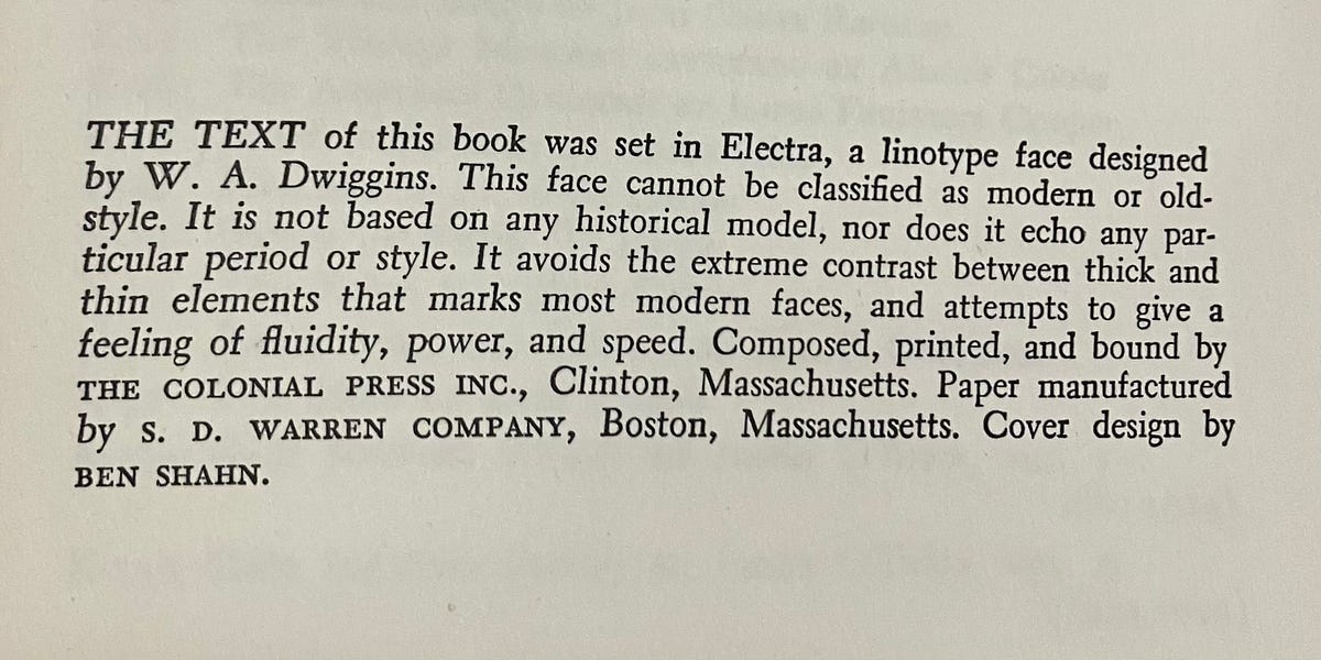
In the colophon of the mass-market, pocket-paperback copy of Georges Lefebvre’s The Coming of the French Revolution that I’ve been reading for no particular reason appears the note on the type pictured above. In case you are like me and you don’t allow images to display in the emails you receive, it reads like this:
The text of this book was set in Electra, a linotype face designed by W.A. Dwiggins. This face cannot be classified as modern or old-style. It is not based on any historical model, nor does it echo any particular period or style. It avoids the extreme contrast between thick and thin elements that marks most modern faces, and attempts to give a feeling of fluidity, power, and speed. Composed, printed, and bound by THE COLONIAL PRESS INC., Clinton, Massachusetts. Paper manufactured by S.D. WARREN COMPANY, Boston, Massachusetts. Cover design by BEN SHAHN.
Who is this text for? It appears just below the author’s bio, as if any curious reader might want more information not merely about the historian who wrote the book — who is credited with submitting “perhaps the longest doctoral dissertation ever written” — but also the typographers involved. The text reads like a combination of an artist’s statement and a sommelier’s tasting notes, evoking a connoisseur-like reader who chooses what to read next based on what font the body copy is set in, and how much “fluidity, power, and speed” it affords.
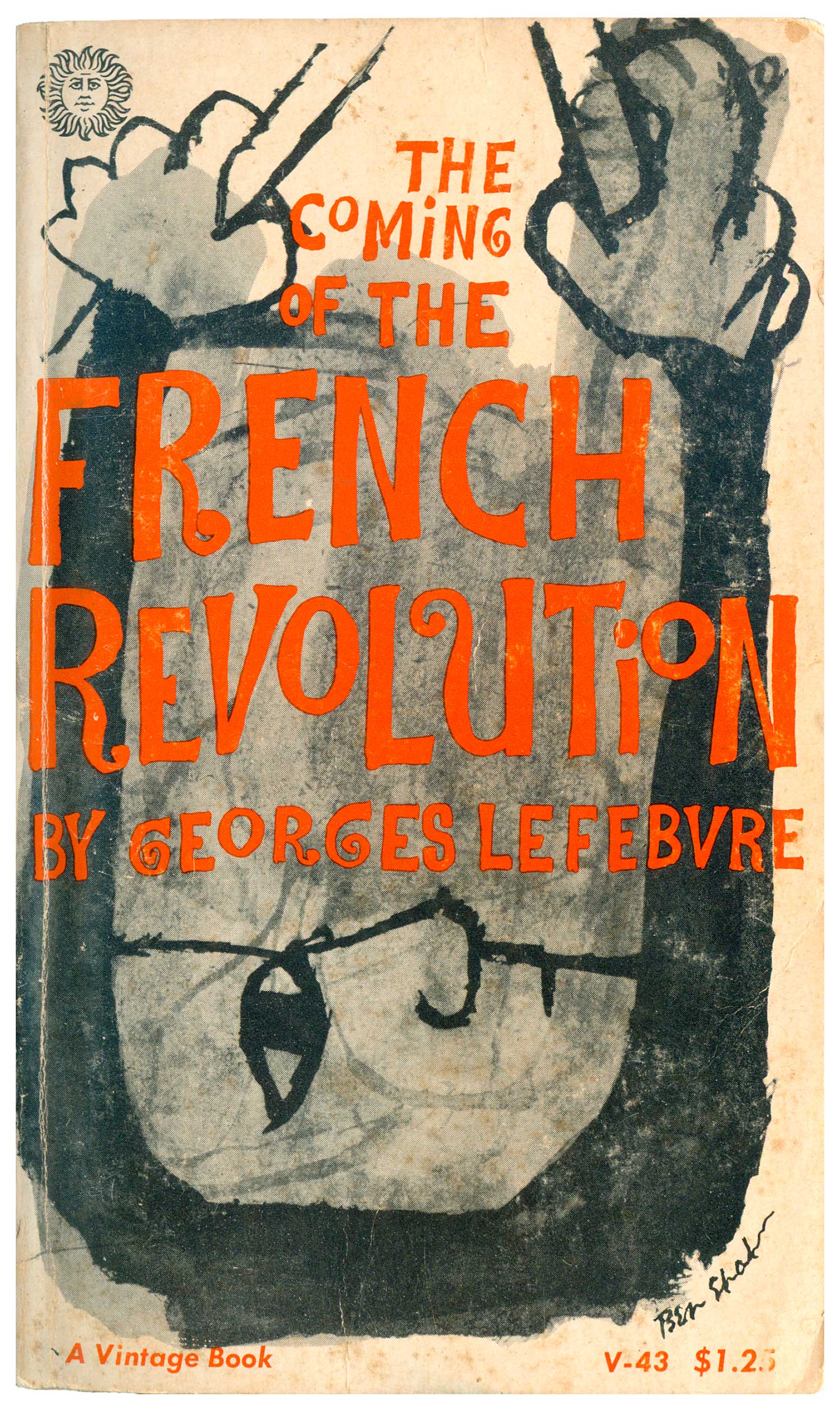
It’s somewhat ironic that W.A. Dwiggins, who I am assuming composed this paragraph, insists on the ahistoricity of his font: Can we really come to terms with the coming of the French Revolution in a typeface that is “neither modern or old-style,” that rejects all historical models? It seems like some oblique commentary on the book itself, a remote echo of the consequences of the history it encapsulates. Whereas it’s easy to see why having a cover designed by socialist artist Ben Shahn made some conceptual sense — he began his career as an advocate for the rural poor, whom Lefebvre credits with enforcing by insurrection the juridical reforms proclaimed by the Constituent Assembly — but what does this noncommittal linotype face have to tell us about freedom and the rights of man and citizen? Mourning becomes Electra? Not this one.
The most plausible explanation for Notes on the Type is that they appear as a professional courtesy to the production editors, and serve to alert readers that more goes into the making of books than writerly inspiration and editorial intervention. Fonts make books legible at a foundational level and shape the reading experience in subtle ways that the Note on the Type hopes to raise to readers’ consciousnesses. It matters to see type at the level of form, as a medium with material characteristics. The notes implicitly urge readers, before shelving a book for perhaps forever, to take a moment to see the window rather than the view. And though they likely go unread nearly 100 percent of the time and thus fall short of that ideal mission, they still signal to other bookmakers that a particular publisher has institutionalized a process for acknowledging the artisanal work that makes printed words.
A commenter on this discussion forum “for professionals and enthusiasts in the fields of typeface design, lettering, and typography” linked to this compendium of “notes on the type” in the Internet Archive (pointing out also that W.A. Dwiggins was “a frequent adopter of the ‘note on the type’”). It turns out that many of them appear in books published by Knopf. They all have the same general tone and format: an acknowledgment of the designer, a location of the typeface within the broader history of printing, and a brisk account of its aesthetic distinctions, with some highly specific details about the serifs, descenders, or weight of the strokes, as, for example, in this haughtily passive-voiced point from the note on the type of H.L. Mencken’s In Defense of Women: “Other characteristics that will be noted are the square serifs without fillet and the marked contrast between the light and heavy strokes.” One will note those unfilleted serifs, won’t one?
The notes on the type can be more than a bit pedantic in their effort to educate the literate public about fonts. They assume an authoritative, faintly impatient tone that presumes a regrettable ignorance in average readers, who are treated as though they have only the most rudimentary understanding of the symbols that make their participation in print culture possible. But the notes can also sometimes seem a bit partisan, taking sides in an obscure struggle among different camps of typographers: The note in Willa Cather’s One of Ours celebrates Old Style No. 1’s “workmanlike quality and freedom from ‘frills’ characteristic of English old styles in the period prior to the introduction of the ‘modern’ letter.” This sounds as if it might have been a better font for Lefebvre’s work, but the author of the note stresses that it too is “of English origin,” so perhaps not. I wonder what “frills” were considered so dubious that they needed to be referenced in scare quotes, as though the note writer could hardly deign to mention them.
The more contemporary notes on the type haven’t changed much in tone. The note in Donald Antrim’s 2000 novel The Verificationist gives a quick bio of Claude Garamond, which, if nothing else, reminds readers that the names familiar from their font menus often refer to historical figures. He “gave to his letters a certain elegance and a feeling of movement that won for their creator an immediate reputation and the patronage of Francis I of France.”I guess the ancien régime lives on after all.
Every time I encounter “A Note on the Type” in all its earnestness, it strikes me as obvious fodder for a Shouts and Murmurs–style parody, and naturally there is one — probably one of several — from 1997 by Bruce McCall. It’s about as “funny” as you’d expect. (“That part of the text not set in Backslap or Bangalore — the lowercase d's, k's, and alternate z's, except after c — is Jiffy-Lube Piscataway Light Narrow, based on a sixteenth-century face closely resembling the late Edward G. Robinson.”)
McCall’s piece imagines a hack freelancer who’s been paid to compose notes on the type and gives voice to his cynical complaints and frustrations. Maybe that was funnier to imagine in 1997, the failed writers working at the fringes of Big Print at tasks that now evoke more nostalgia than contempt. And maybe the tone of the notes seemed much more unremittingly pretentious in the midst of a ubiquitous print culture whose supremacy was unchallenged. It was easier to laugh at the idea that typographers were trying to claw away some of the glory that was due to writers and editors, as if anyone could ever care more about the appearance of words than what they mean. When publishing was considered a glamour profession, knowledge of nerdy arcana like “fonts” was probably akin to knowing about grips and gaffers and best boys on a film set, as McCall’s piece suggests.
But now words are everywhere treated as data, as numbers, and they are rarely printed at all. Everyone has some working knowledge of fonts and even strong opinions about them, even if they rarely read books. Words pile up on trillions of screens without being read by anyone, so much visual clutter and static to human eyes, even if they will be registered and processed by the machines that are increasingly programmed to produce them. The impact of fonts change when no one is expected to turn words into meanings inside their own heads, when autocratic governments in league with the tech industry work to compel everyone to have meanings dictated to them without the intervention of their own thought processes. Fonts perhaps become more salient as they become the only thing that people are expected to play with when it comes to words, once it is drilled into everyone that it is required for efficiency and political conformity to let machines do all the writing and the editing and the “thinking.” We won’t have official authority to change what words mean on the page, but we’ll be encouraged to think that changing the way they look is really the best way to express ourselves.
Internal exile is set in a default system font chosen by the administrators of the platform’s content management system.
What's Your Reaction?
 Like
0
Like
0
 Dislike
0
Dislike
0
 Love
0
Love
0
 Funny
0
Funny
0
 Angry
0
Angry
0
 Sad
0
Sad
0
 Wow
0
Wow
0


