


The Visual World of 'Samurai Jack'
Welcome! It’s a new Sunday issue of the Animation Obsessive newsletter, and here’s what we’re doing today:
1) On the visual approach of Samurai Jack.
3) Animation newsbits.
With that, let’s go!
1 – Stories in pictures
Images alone can tell a story. Just look at Flow, the Oscar winner that has no words but captivates anyway. It stays tense, and puts across character, without a line of dialogue.
That’s hard to do in a movie. It might be harder in a series: the projects are more broken up, more chaotic and usually faster. Lots of animated shows use talk-y scripts to get through — because it works. Even a classic like The Powerpuff Girls relies on its snappy, funny writing.
Genndy Tartakovsky was central to that show — just after Dexter’s Lab, his hit from the mid-1990s. Dexter involved plenty of writing, too. And Tartakovsky was getting sick of it.
“After doing Dexter and Powerpuff, I was burnt out on dialogue,” he once said. He wanted to get away.
That was a core inspiration for his original Samurai Jack (2001–2004). “There are so many sitcoms, especially in animation, that we’ve almost forgotten what animation was about — movement and visuals,” he told the press after the show debuted. The Samurai Jack crew aimed to “tell the stories visually… tell a very simple story visually.”
Talking was kept to a minimum. Instead, Samurai Jack would need enough richness and variety in its look and movement (and its filmmaking) to keep people gripped without words.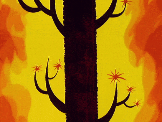
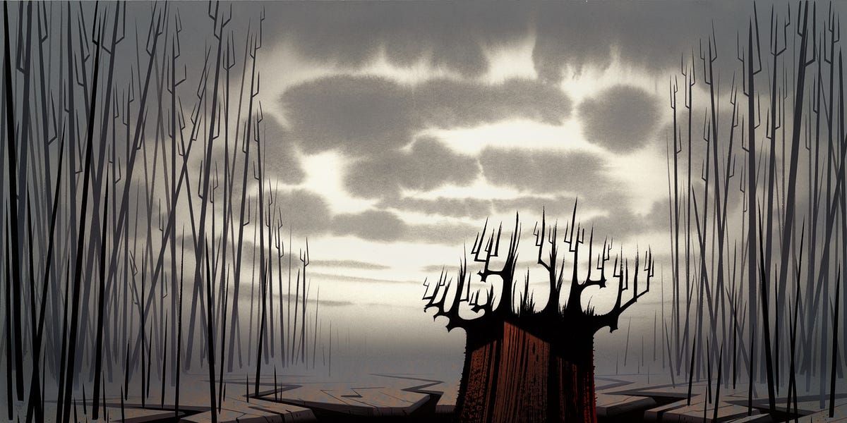
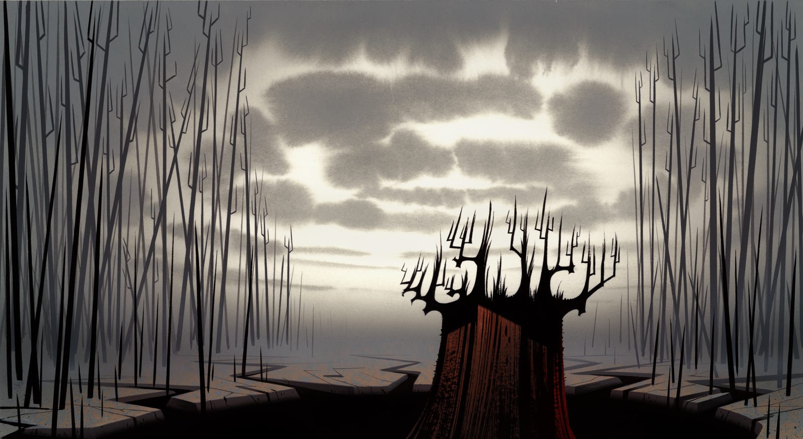
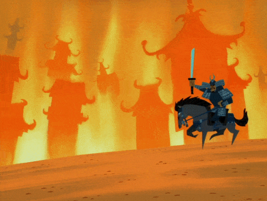
There was no doubt about the size of the risk that was Samurai Jack. See episode eight, which finds Jack battling a copy of himself — made from his own anger. Lingering shots of trees on fire, gorgeously painted, punctuate the fight.
Toward the end, Jack realizes that his emotions are out of control. We cut to a burning tree again, and the camera moves in closer, up to the bark. Then the flames stop, and the tree dissolves, and a calm waterfall appears. After almost a minute and 20 seconds of no talking (and no characters on screen), we snap to Jack’s face. Yet a story’s been told.
This stuff asked a lot of the kids in Cartoon Network’s audience. Tartakovsky was defiant about it. “I’ve always felt that kids are a lot smarter than we’ve given them credit for, but we’ve never given them a chance to figure things out as they’re watching television,” he said in one interview. Elsewhere: “as long as I can make films, I’ll always treat kids as adults and at the same intelligence level as I am.”
The network execs gave him that freedom. Mike Lazzo greenlit the show’s loose, bare pitch over dinner. Linda Simensky explained, “Genndy had done such a good job up until that point — if there was anyone we could trust, it was Genndy.”
In fact, she said, “[W]e were really just excited about the fact that it was so different and so unusual.”
Tartakovsky’s team put together a test for Samurai Jack (watch), animated by the outsource crew in Korea. The higher-ups didn’t request a test, but Tartakovsky wanted proof. “[I]t came back. And it worked,” he remembered. Two minutes of wordless action and atmosphere held up. Something similar happened with episode one:
… luckily for us, the overseas [team] did an amazing job, and the first episode came back, and I remember being like, “Wow. There’s something here.” ... And the first episode was so silent, too, ‘cause we had that whole flashback sequence ... Mike Lazzo and Linda Simensky ... [go in to watch it], and then you’re sitting in this little editing office … and it’s complete silence. ... I’m looking at them, and they don’t have any expression on their faces. And I go, “Wow.” Then I start sweating.
He figured the show was dead — but the execs were fascinated. “Speechless” was the word Lazzo used. This huge, costly experiment in visual storytelling went ahead.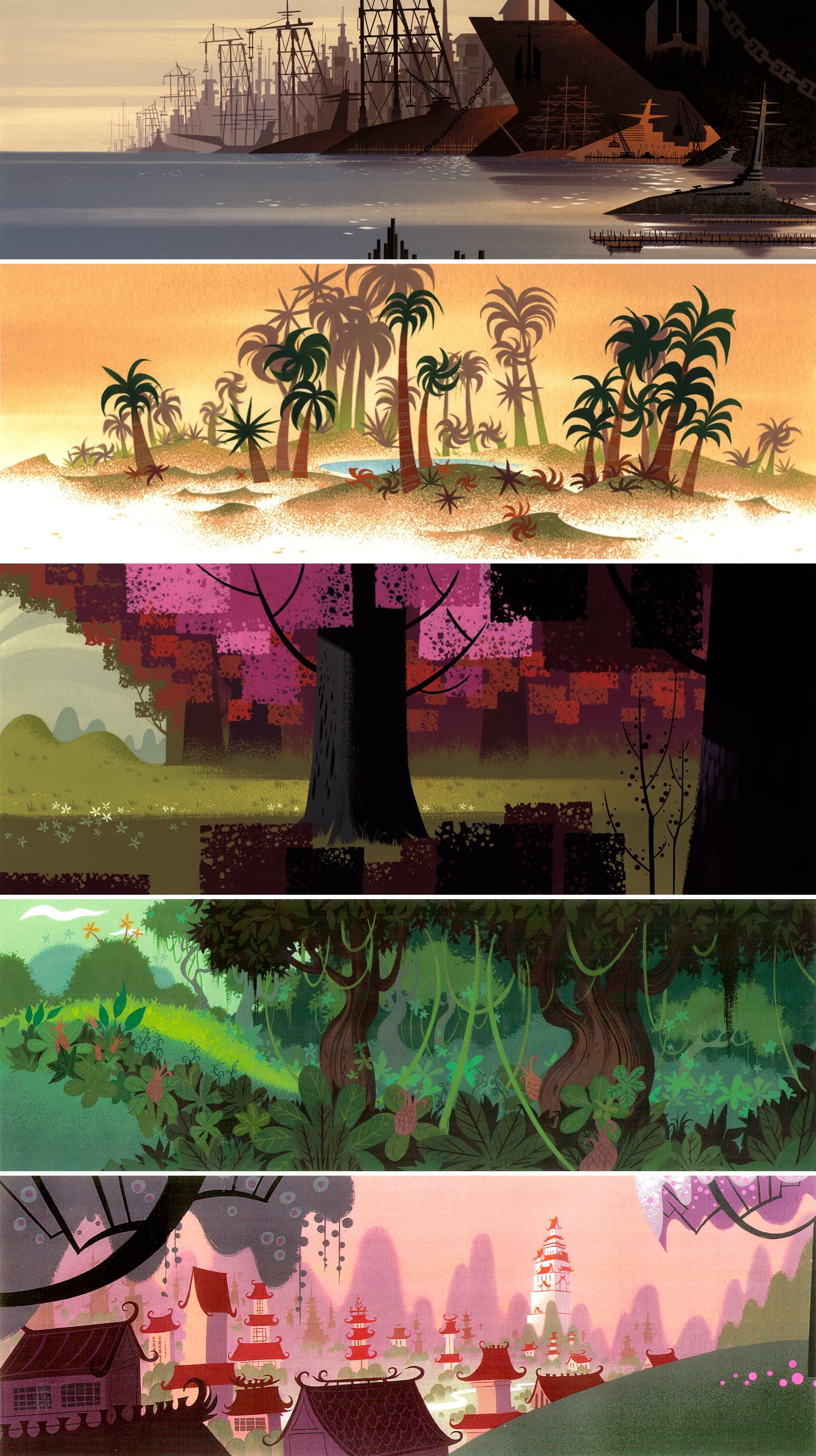
Tartakovsky credits a lot of Samurai Jack’s success to art director Scott Wills. “It really came together when [he] came aboard. ‘Cause when Scott started to paint, all of a sudden, we had lighting, we had mood and atmosphere,” he said in the 2000s.
These things were critical for the show. Again: images couldn’t carry without depth and richness. Tartakovsky was looking at live-action movies from the ‘60s and ‘70s — Doctor Zhivago, Lawrence of Arabia, Kurosawa films. Another main influence was Hayao Miyazaki’s work. As Tartakovsky said, films like these:
… really made the background a character. ... It all kind of came down to filmmaking with me. Because usually we are drawing these backgrounds and they’ll just get a pan and then we’ll just go to the next sequence. I wanted to do, maybe, a minute or two sequence of just establishing the environment. You really get to feel where Jack is … It’s like watching Lawrence of Arabia, you really feel that desert. And it’s a really cool feeling and so I thought, “Ah, how much cooler would you feel if you’re looking at these great drawings with this really unique color and a great mood?”
He wanted to treat background paintings like classic movies treat landscapes — which wasn’t done on American television. But Samurai Jack did it. And Wills’ painting techniques (which we covered in a recent issue) made it possible.
The style was unique. Wills took from mid-century cartoons — the abstract geometry and color — and blended them with other things. He wanted to “combine everything that’s good about realistic painting and feature [animation] painting, and everything that’s good about [UPA-type] stylization,” he said. The idea was to “have cinematic lighting, with mood and depth, but at the same time have it feel stylized.”
For the backgrounds to remain engaging across the series, freshness mattered: there were frequent new locations and surprising color choices. “We’d have … a rule: no green grass, no blue sky,” Tartakovsky recalled.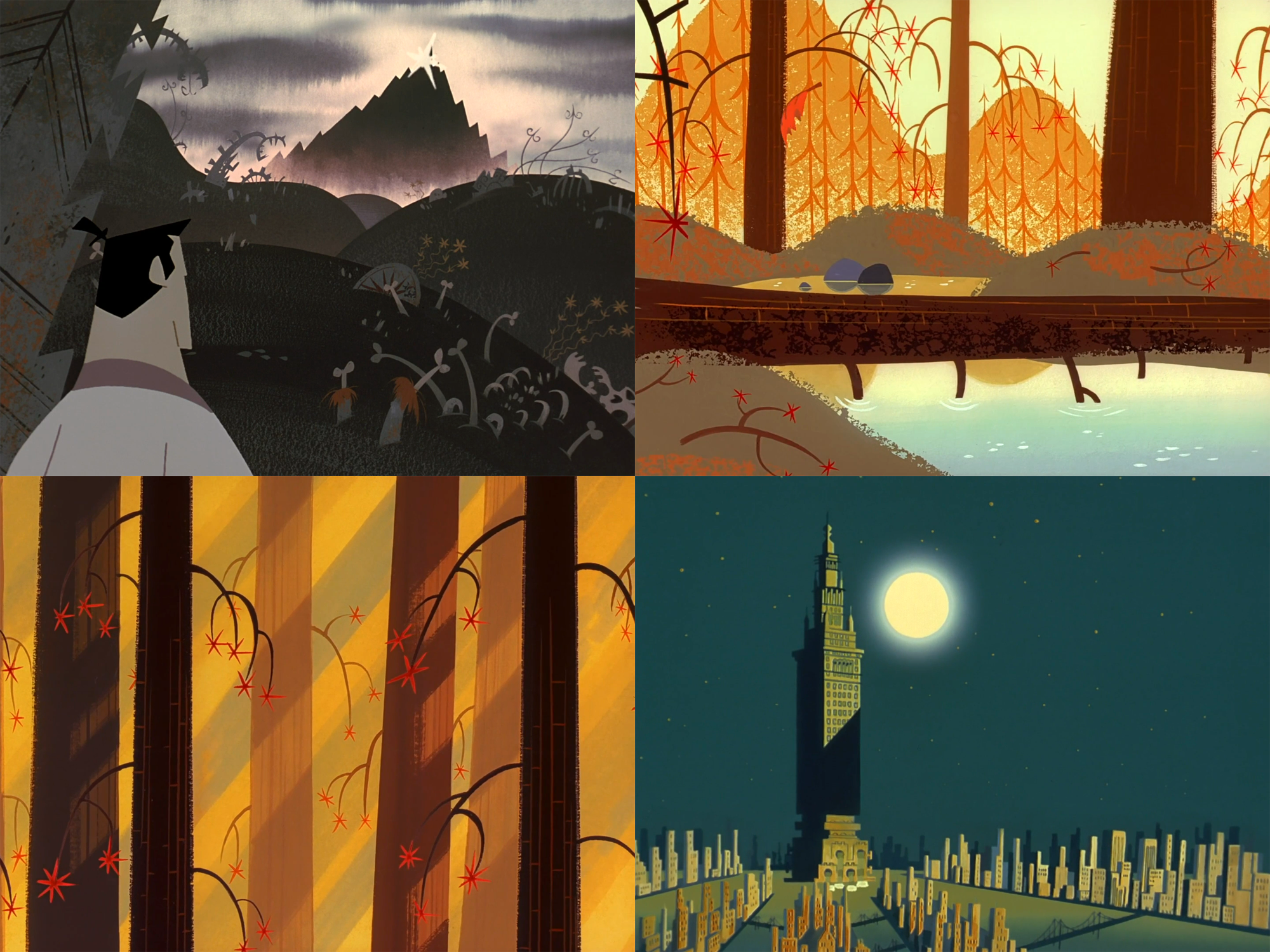
And all of this stuff had to be handled delicately, for technical reasons.
Samurai Jack doesn’t use black outlines for its characters. Tartakovsky compared the look “to old ‘50s Disney, like Sleeping Beauty, and to the Golden Books.” The main reference for it was Toei Doga’s Little Prince and the Eight-Headed Dragon, which he’d seen on LaserDisc in the ‘90s. (Even Aku visibly borrows from that movie’s Fire God.) But, without black outlines, a character can vanish into the background colors.
Most of Samurai Jack’s final background art was painted at Rough Draft Korea. There were communication gaps between the studios. Dan Krall, the show’s co-art director, put it this way:
Samurai Jack is like a flesh tone, right? And the way that it works — you don’t paint every single background. You paint a giant key of a location and ship it overseas, and they do all the layout shots overseas. So, if ... [a] portion of the sky, or whatever, ... [ends up] flesh-toned, the sequence comes back and then Jack’s nose disappears against the sky because they’re the same color. Because you’re not art directing every single scene.
Scott Wills worked long hours to bridge these communication gaps — scanning and correcting key artwork to guide the painters. They used that material. “[T]he people doing the correction [in Korea] were individually selecting every color [in the final backgrounds] and forcing it to match the key,” he recalled of his visit to the studio. “They were working so fast I couldn’t believe my eyes!”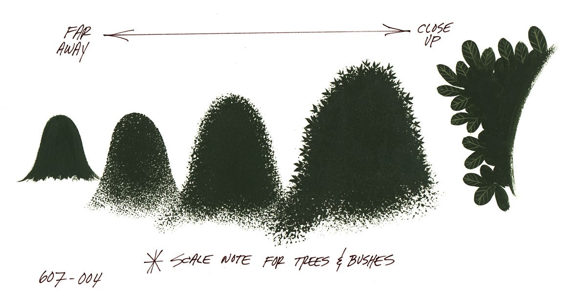
Samurai Jack pulled visual ideas from everywhere — Akira and The Andromeda Strain (1971), for example. Some elements of the show, like its rendering of distant hills, are conspicuously close to things in The Adventures of Prince Achmed.
But the mid-century cartoon influence went all throughout the project. It’s obvious in the endless parade of characters, a number of which were designed by Lynne Naylor. (“[W]e had 60 or more designs to get in every two weeks,” she said later.) And it’s in the movement, such an important piece of these image-driven stories.
Tartakovsky had fallen in love with UPA at CalArts. His friends adored that era — Jay Ward, Hanna-Barbera and so on. This helped Dexter and Powerpuff. “We realized that we didn’t have the time or money to produce animation that you might see in a classic Warner Brothers short or a Disney feature,” Craig McCracken once said, “so we decided to design shows to work within the limitations that we were under.”
There’s brilliant limited animation in these series. Tartakovsky idolized Bobe Cannon (Gerald McBoing-Boing), the maestro of the limited style. Here’s Linda Simensky:
Tartakovsky noted that most people would associate Dexter’s art direction with UPA, but to him, timing was most important, and the director Robert “Bobe” Cannon in his UPA period was most influential. Cannon, he noted, developed funny, interesting movement and timing for each character, so that every character moves in its own unique way. Tartakovsky noted that he tried to do the same with Dexter and Dee Dee and that each character moved with his or her own stylized animation.
You find a Cannon-like approach across Samurai Jack. Everything is clipped and defined — and there isn’t much interest paid to realism. There are long, long holds and looping motions. Action is segmented: Jack and the others tend to move quickly and then abruptly pause, in a rhythm. Above all, we feel the characters through their timing, and each bit of motion is treated as a creative problem to solve.
Tartakovsky argued that animation “was created … to show funny, new, interesting movements and images,” and that kind of invention was his goal here.
Once again, it was the hard work of the artists in Korea that made it happen. “I wanted it to not just be an overseas studio,” Tartakovsky said. He was looking for more of a partnership with Rough Draft: “we gave them front credit, and then when we won awards, they won awards.”
One crucial figure was directing animator Jim Jeong — Tartakovsky wrote that he “was one of the best animators on Dexter’s Lab and then I hand-picked him to supervise Samurai Jack.” Like Paul Rudish of the Jack team said:
... it was just really great that Jim could get involved and really try to, you know, inject his own personal stuff into it. And feel like he had an opportunity to do that. Usually, it’s just, you know, “Get it done, get it done, get it done.” But he actually cared and ... [did] a lot of beautiful animation, just because he’s an excellent animator himself.
Besides the success of Tartakovsky’s earlier work, there wasn’t much reason to think that Samurai Jack would do well. “It could backfire,” Mike Lazzo admitted in 2001, just after the premiere. But Cartoon Network took risks back then. Craig McCracken’s Powerpuff had been a risk — a large one, which had paid off.
Samurai Jack never reached that level. It was popular, though. And that, according to the cynical view, shouldn’t have been possible. Even with its robots and samurai and demons and zombies, Samurai Jack didn’t really fit with the mass culture of its time.
“All this stuff we do is classic film techniques. Very simple cinema, just told more visually,” Tartakovsky insisted as the show was underway. But it felt stranger than that. Not much on TV was willing to tell stories this way — especially in animation. The show talked up to its viewers. It was often goofy, but it was rarely less than smart.
What it did was hard to do. Tartakovsky and the team — in the States and abroad — did it anyway. Plenty of shows went safer than Samurai Jack and were bigger in its day. But it’s images like that burning tree that stick in the memory.
2 – Newsbits
The French director Sylvain Chomet revealed that he’s doing “a sort of spin-off of The Triplets of Belleville, but this time without the bicycles.”
The Tragedy of Man (2011), a Hungarian epic in the making for more than two decades, is coming very soon to America. Deaf Crocodile just opened pre-orders.
Next month, in France, Annecy’s MIFA event will have “a delegation of 10 animation studios” from East Africa, including five from Kenya.
Another from France: the movie Arco, which premiered at Cannes, will get a stateside release through Neon.
In Russia, historian Sergey Kapkov is getting ready to release a book of interviews about Studio Ekran — an often-overlooked TV animation studio in the USSR. This one follows Legends of the Soyuzmultfilm Studio, his excellent book from 2024.
The government of Spain is jockeying to be “Europe’s leading audiovisual hub” with a €1.71 billion plan, reports Cineuropa. Animation is set to benefit.
In America, the venerable Sesame Street has been picked up by Netflix — but it will reportedly stay on PBS, too.
Insectarium is a stop-motion feature from Mexico, directed by Sofía Carrillo (Guillermo del Toro’s Pinocchio). She spoke to Radix about the state of the project.
Last of all: we looked into the reason that The Adventures of Prince Achmed has no absolute length, and the looseness of frame rate in the silent movie era.
Until next time!
See Genndy’s Roundtable, a DVD special feature. Quoted throughout.
Quotes from a Comic-Con panel in the early 2000s and the Los Angeles Times (August 30, 2001).
The second quote is from Draw! (Fall 2001), a major source.
From the book Makin’ Toons, also used a lot.
See The Atlanta Journal (August 12, 2001), used a few times.
From the Red Carpet Report interview with Tartakovsky, Wills and Phil LaMarr.
The quote about Golden Books is IGN Unplugged (May 2001). Artist Chris Battle described Tartakovsky’s encounter with The Little Prince in a tweet.
From Dan Krall’s interview with The Cartoon Chronicles.
See this blog post.
Akira gets name-checked in The Making of Samurai Jack, a DVD special feature.
See Naylor’s interview with AWN.
McCracken said this in Creating Animated Cartoons with Character.
From Simensky’s essay “The Revival of the Studio-Era Cartoon in the 1990s.”
From the Thousand Oaks Star (August 3, 2001). Tartakovsky later told the Los Angeles Times, “The UPA films were very, very artistic, but very character driven … The characters were more strongly realized than if you’d used traditional techniques.”
See Tartakovsky’s Instagram account.
From the Calgary Herald (January 31, 2003).
What's Your Reaction?
 Like
0
Like
0
 Dislike
0
Dislike
0
 Love
0
Love
0
 Funny
0
Funny
0
 Angry
0
Angry
0
 Sad
0
Sad
0
 Wow
0
Wow
0