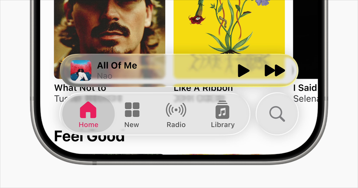
I watched the initial presentation during WWDC 2025. My initial thought was: they're getting people used to transparent UIs for spatial computing (mixed reality environments where digital interfaces blend with the physical world). My immediate second thought was, 'wow, you can't read a thing - are they serious?'.
Skeuomorphism done right (and wrong)
Designers have always borrowed from the real world, though these metaphors often outlive their origins. The universal save icon? Still a floppy disk, even though entire generations have never seen one. Attaching a document? A paperclip. Delete something? Trash can.
These started as clear functional metaphors, but many have become purely learned conventions. We know what the save icon means not because we work with floppy disks, but because we've been taught this symbol equals 'save.'
Apple's been a pioneer for this, especially on mobile where touchscreen interfaces were entirely new to users. Earlier computing had already established foundational metaphors—the desktop with folders and a trash can, documents and filing systems. But Apple took this further on mobile. The iBooks design? Representing a bookcase. Notes looking like a yellow legal pad. Contacts as an address book. Calendar with leather binding.
Skeuomorphism served a real purpose when computing was new. These visual metaphors helped users understand unfamiliar digital concepts by connecting them to familiar physical objects. The trash can for deletion, buttons that looked pressable—these weren't just decorative choices. They solved actual usability problems by providing clear functional metaphors.
So it's no surprise that Apple is doubling down on transparency for their new design system. Transparency in spatial computing makes sense—digital UI that's not too in-your-face, intertwined with the real world. I can see the appeal of that future.
The problem isn't that transparency is inherently bad design. In the right context, it works beautifully. The issue is when design decisions prioritize how something looks over how it actually functions. This is where things get problematic. And that's exactly what's happening with Liquid Glass on traditional interfaces.


:max_bytes(150000):strip_icc()/20250722-MEATRESTINGUPDATE-Butter-basting-steak-fish-liz-clayman-d9afb24942da4cde9850708f230400f6.jpg)


 Like
0
Like
0
 Dislike
0
Dislike
0
 Love
0
Love
0
 Funny
0
Funny
0
 Angry
0
Angry
0
 Sad
0
Sad
0
 Wow
0
Wow
0